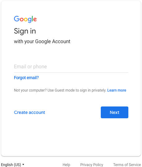
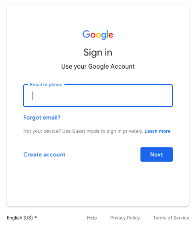
Those eagle eye users will notice a difference in the Google Log in page over the next couple of weeks. No need to worry, it is planned and legitimate.
Currently, the log in box looks like this:

Soon, it will look like this:

Some of the changes will include tweaks to the Google logo, an outline around the text field, and center alignment of all items on the screen.
